Tuesday 30 August 2011

About a Boy....


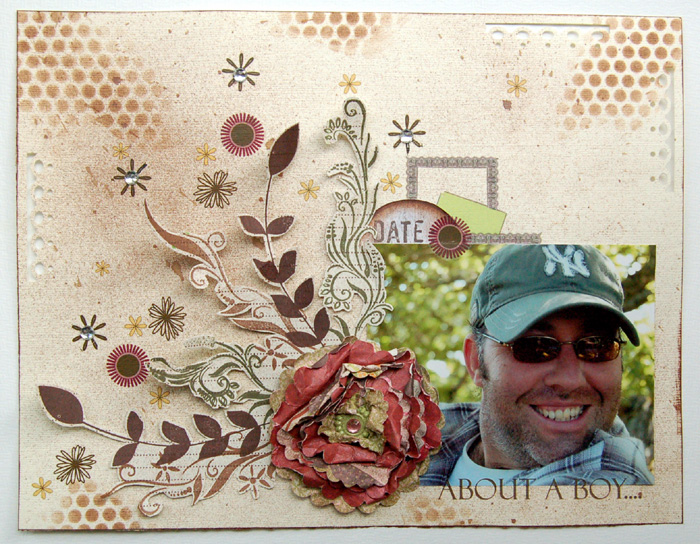
I LOVE, LOVE, LOVE how this layout turned out - I think it is my favourite ever that I created using Upsy Daisy Designs.

But have a look for yourself, and see what you think.

** click on image to enlarge **

There is actually a story behind this layout concerning its "making-of" story. Believe it or not but this layout went initially into the trash. 

Twice.

I know I wanted to create a flower from a layered, crumpled, misted set of papers cut with the scalloped circle Nestability dies. So that one came first and I hated what I did with it...so much so, that I crumpled it up even more and chucked it in the bin. Then I started to randomly stamp flourishes onto a sheet of paper and thought that the flower may actually look kind neat on top - out of the bin it came.


But for some reason, the flourishes and flower did not work with any of the photographs I had in mind or indeed with any of the ideas I had for a layout. After two hours of shuffling my papers around, I TORE the layout to pieces (including tearing the stamped images) and it went right back in the bin...flower and all.

I just thought that this was not meant to be and admitted defeat. But only one day later inspiration struck: I fished all the pieces of torn paper out of the bin, glued it all together again and started fussy cutting. That was how the above layout came together - once I cut along all the flourishes, the design of the page was just a doddle...weird, hu?

Anyway - after I added some rub ons, bling, mists and ink, I fell in love with the layout and I glad I fished it out of the bin :)


Sunday 28 August 2011

Donna Salzar Aug II


The below post went live on the Donna Salazar blog today.

Do you ever find yourself starting out with a specific idea in mind, only to realise half way through the project, that it just doesn't work - but you somehow have put too much work into it to discard it?

Yeah, that happened to me this week, when I had this idea in my head to create my own background by using the fabulous Sprightly Sprockets dies as a stencil and sprayed over the White Coloured Rose paper with a generous helping of various Smooch Spritzes.

**click on any of the pictures to enlarge their view (which incidentally also sharpens the image} **


The end result looked really cool - exactly how I imagined it.


The next step was to enhance the outlines with a black pen.
Never be too exact - I find it looks much better when you draw across some lines in a loose and random fashion.


I think the background looked great as it was but I wanted a few more splashes of contrasting colour on there and added some sprocket cuts in pink from the One Sheet Wonderful , which I also outlined with a black pen.


Now this was done I struggled to turn this background into a layout. I shuffled pictures and embellishments around, but nothing worked. The background turned out to be too overpowering to allow any picture to become the focal point, so what was this girl to do?

First, I took another sheet of paper - of a completely different colour base, the Vintage Gears from the Antiquities line.

I then added a little Smooch Spritz  in wood stain and my new favourite stamp All My Love.
I adore how subtle it can look, almost as if it was already part of the paper.


All of a sudden, it clicked and I knew how I could incorporate my previously stencilled background: by cutting the shapes individually and use them as embellishments to guide the viewer through the layout and towards the photograph!


To "soften" the brightness of the pink/blue combo, I added some layered flowers created from the Crafty Chronicle and inspired by the amazing flower tutorials of my DT Teamie Natasha.


I wanted to carry the theme of the sprockets throughout the layout and used the biggest of the dies as a template to embroider its outline onto the paper.


So, you wanna know how the layout ended up?
TOTALLY different from how I intended it to look - let me remind you of how it started out:


And this is how it turned out:


Products used
Other products
Stickers: Jillybean,Pens
Pens: Uniball Signo in white & black, Zig Millenium pens in black

Embroidery floss, pearls, punchinella


Thursday 25 August 2011

Papermaze DT - August PT III


The below post has recently been published on the Papermaze Blog.

Today I would like to share a quick post on how to create some easy embellishments from your scrap left overs.

** click on each of the images within the post to enlarge their view **


The above three tags were all done using scraps and stickers from the Watermelon Gazpacho line of Jillybean Soup. They can easily be used to adorn layouts, minibooks or cards - just make sure you chose your sentiment stickers accordingly.

Here are now the tags individually for you to view.
Enjoy!

Additional products used:


Sunday 21 August 2011

Say What???

I love scrapping vintage photographs, especially the ones of me as a wee girl. Some of them trigger lots of memories, like this one - the doll, I am clutching had the brightest red hair you can imagine and the freakiest face. In truth, it looked like a double of Chucky....but I loved it, and carried it everywhere

** click on image to enlarge and sharpen the view **
Products:
Cardstock - Poundshop * Papers - American Crafts * Stickers - American Crafts * Punches - Martha Steward, Fiskars * Mists - Cosmic Shimmer

On another note , I am excited to say that I have re-opened my little online shop again. I have been asked by a few peeps if they can purchase some of my crochet stuff and some of my cards, so I figured - why not put it out there in a shop?
I am adding bits and pieces as I go along and I was also super excited to get my hands one some fun vintage stuff the other day - perfect pieces either to use on paper crafting projects or just to admire :)))

If you want to have a gander around - just click on link below the Logo to be taken to the shop.
http://konfetti.yolasite.com/


Wednesday 17 August 2011

E.L.F.

You may recall me raving about Avon, right?
Well, I still love and use most of their stuff but have always found that their nail polishes were utter crap (and that is putting it mildly). Their nail hardeners are fab but the polishes never last longer than about a day before they start splitting or peeling!!

I tried may different polishes from Avon and I was disappointed with every single one of them.

That's when I found eyes, lips, face or E.L.F. (for short). Take a look at this, but beware: chubby sausage finger alert :)))

That is how only one layer of E.L.F. nail polish looks after seven days of typing, crafting and crocheting - not bad hu? There is no top coat, just one layer of E.L.F. and it only slightly started to fray at the top of the nail.
With Avon polishes, my nails looked like that already after one day AND I generally needed two to three coats to get close to the shade the polish claimed to be.

Now for the best part about E.L.F. - the price:
One bottle of polish (10ml)  is £1.50 - for REAL!!!!

I got myself a polish in chocolate, in nude, and a nourishing cuticle pen all for £1.50 each and waterproof/volumising mascara for £3.50

The products are of real good quality, and this way I can top up my nail polish collection without breaking the bank. Also, I am saving a LOT of money on the mascara now - I used to buy L'oreal Lash architect for £8.79 , with E.L.F. I can get two AND another nail polish for the same price (and have a little change left).

Do you have found any good deals lately, which made you happy?

Monday 15 August 2011

Papermaze DT - August PT II


The following blog post has recently gone live over at the Papermaze Blog.

Whenever I work with a paper collection that at first glance "dictates" as to what kind of projects you should use it for, I tend to rebel against it.

Take the Watermelon Gazpacho Line from Jillybean Soup for example, with its watermelon and swimsuit designs. It pretty much screams "summer", "juicy", "hot" and "fun" and you wouldn't really use it for anything else but Summer/Beach layouts, right?

Wrong.

There is SO much potential in such papers, just think out of the box and embrace the flip-side, which is more often than not of a less prominent design.


I decided that the pictures I took of one of the guards at Rosenborg Castle would be complimented perfect by the above papers, wouldn't you agree?

** click on image to enlarge **

And while I was in my "rebel-phase" I thought might as well go really mad and do what it generally seen as a "no-no" these days - to cut the object of the picture out of the photograph...yeah, I know: shocking!
But I LOVE using photographs as embellishments and this way my layout does not look dwarfed by including two photographs.

I simple raised the cut photograph with the help of some Stix2 Adhesive Foam Pads and stuck it on top of the other picture.


Another fun tip to make parts of your title stand out a little bit more from the background is to add some highlights to individual letter with the help of a White Signo Pen.


I hope my post has somehow inspired you to embrace your inner scrapbook rebel and to look for the alternative use of some themed papers.

Additional products used:


Saturday 13 August 2011

Donna Salazar - August DT Pt I

Below post has gone live on the Donna Salazar Blog today:

Donna's Artistic Papers are so versatile and you can create quick and easy artistic embellishments to adorn any kind of project.

I have had this clock for years - it was a plain silver colour and looked overall boring and I really did not know what to do with it, to give it some ooompfh. No amount of polishing and scrubbing did make it look nice, it just looked cheap. While I had forgotten to take a picture of the clock in its original state, I found  similar image when searching online.

** clicking on any of the images in this post will enlarge/sharpen the view **

Before:

After:

First of all I chose sheet of paper from the Spring in Bloom collection, lying the clock - face down - onto the sheet and drew with pencil along the outlines. Once I cut the piece to size, I measured the distance between edge and clock face from all four sides. Again I drew some pencil lines along my markings and used a craft knife to cut out the square in the the middle.

Then I cut the label and letters from the One Sheet Wonderful paper from both the Spring in Bloom and Antiquities collections as well as the butterfly from the Butterfly Harmony paper.


See that star flower? I cut four different sized star shapes from the Crafty Chronicle, gave it some Smooch-lovin' and inked the edges with Clearsnap's dark brown Cats Eye chalk. I then layered the stars on top of each other, placed a flat-backed pearl in the middle and placed the completed star flower on top of one Artistic Journal Cards.

Finally I layered all previously cut shapes onto a tag and adhered it to the right hand side of the clock.


But somehow I found that the left hand side was missing something and the clock looked somewhat imbalanced. So I coloured two of the roses from the Spring in Bloom 6x6 square with ProMarkers and attached them with glue dots to the background.

A few more pieces of bling attached the bottom on right hand side of the roses and my old and boring clock does looks now really pretty. To wake up in the morning, facing such a colourful clock makes jumping out of bed much easier.

I hope you enjoyed today's post and maybe you can find yourself and old, unloved clock to alter. If you do, feel free to link back to your creation. I'd love to see what you do.
 
Products used
Other products
Pens - ProMarkers, Zig Millenium in blackTag - Rusty Pickle


Monday 8 August 2011

Papermaze DT - August PT I


Below is a post which has gone live over at the Papermaze Blog.

Do you sometimes look at some of you new crafting purchases and just sigh because you cannot seem to find the necessary inspiration? It can be frustrating if you are stuck and are just hoping for anything that may trigger your creative process.

Well here is how I usually snap out of it:

Take the papers that you have decided to work with and just lay them out in front of you.


More often than not you will find a recurring dominant colour scheme within your papers, in the case of the Watermelon Gazpacho line from Jillybean Soup the blues and greens stuck out to me the most, so I decided to go with blue as my main colour and add a touch of green. To help kickstart my creative juices I went to search for images on the net, via Pinterest and found these two beauties


Browsing for the colour combination "blue and green" and looking at the pictures - which my search returned  - got me straight into creative mode and this is the result.

**click on image to enlarge **

Once I started there was no stopping me and I was pleased with myself that I managed to even come up with a little embellishment money saver along the way! See those flowers on the right bottom corner, the ones with the twine and buttons?

You could spend a pretty penny and buy them ready made (which incidentally may leave you with a pack of flowers in a colour you don't really want to use again), or you can grab some of your older stash such as American Crafts Greenhouse Lucy Flowers 
and some WRMemory Keepers Bakers Twine in coordinating colours
and just wrap this across the flowers (which are actually scored along each petal, so it makes it super easy to fasten the twine).
Finish it off with a button on top and you have a very unique embellishment.


The other rosette flower on the left bottom corner was created from the cut off-strip of paper which I usually have left over from trimming the 12 x 12 papers to my favoured size of 8.5 x 11.


I love those rosettes, as they are really easy to make. Recently I have created a step-by-step tutorial   on how to create the rosettes. Hop on over and have a look if you don't know yet on how to make your own rosette flowers.

Additional products used